Posts tagged “form”

The Shape of Food and Other Things (To Come)

A provocative survey article on Edible Geography explores the form that food (specifically Chicken McNuggets and cheese) is presented in.

It’s a safe bet that McNugget morphology tells us something important about the sensory framework through which we experience the world. Within the constraint of basic economic considerations (shapes that can be made on the same line and ship well), the bell, bow-tie, ball, and boot are sculptures made by our mouths-ubiquitous, finely-tuned artifacts that reflect by our increasingly sophisticated understanding of human sensory perception.

Early in my career we talked a lot about how digital technology was changing the range of possibility. Form didn’t have to follow function. Industrial designers could make digital cameras (an example early project where we grappled with the form factor for the device and the metaphor/mental model for the software) look like anything.

Apple’s original QuickTake 100 camera took advantage of that freedom.

It was not a successful product; the form (and it’s lack of traditional camera references) was certainly not the only reason, but that product might represent some of the most extreme of early experimentation. Now our digital cameras look pretty much like the film cameras they’ve fully displaced. At the same time, revolutionary (e.g., digital) products can seen as making culture (e.g,. cell phones as the new concert arena lighter) as much as reflecting it.

The story of the Lytro camera, more recently, suggests that it too is trying to introduce a revolution into a staid category (the aforementioned digital camera), and it’s form announces that it’s somehow different.
lytro

I can’t help but assume the packaged and processed foods people have a lot more data and a much more refined (if you will) understanding of what forms connote and how they motivate. If they are speaking to our liminal behaviors and our reptile-brain sensory processing then they are able to use that to their advantage when other forms of design can’t, at least not yet.

Hertz, Donut*

*Referring to a dumb, fun, and rather apt joke

I tried to opt-out of unwanted marketing email from Hertz. The link in the email took me to this outrageous page.

Go ahead. Try to parse the nested logic and dense legalese. To add insult to injury, I was unable to submit without the ugly red form error admonishment (“You have entered an incorrect option. Please correct and resubmit”) for the whole first set of options. I eventually had to submit it without any of those checked. Will I get more unwanted marketing email? I’ll have to check with my lawyer about that.

ChittahChattah Quickies

The Mechanic Muse – From Scroll to Screen [NYTimes.com] – It’s easy to get caught up in the user interface changes that digital technology brings to everyday activities like reading, but of course there are very cool precursors (if you will) in the history of book design.

But so far the great e-book debate has barely touched on the most important feature that the codex introduced: the nonlinear reading that so impressed St. Augustine. If the fable of the scroll and codex has a moral, this is it. We usually associate digital technology with nonlinearity, the forking paths that Web surfers beat through the Internet’s underbrush as they click from link to link. But e-books and nonlinearity don’t turn out to be very compatible. Trying to jump from place to place in a long document like a novel is painfully awkward on an e-reader, like trying to play the piano with numb fingers. You either creep through the book incrementally, page by page, or leap wildly from point to point and search term to search term. It’s no wonder that the rise of e-reading has revived two words for classical-era reading technologies: scroll and tablet. That’s the kind of reading you do in an e-book. The codex is built for nonlinear reading – not the way a Web surfer does it, aimlessly questing from document to document, but the way a deep reader does it, navigating the network of internal connections that exists within a single rich document like a novel. Indeed, the codex isn’t just another format, it’s the one for which the novel is optimized. The contemporary novel’s dense, layered language took root and grew in the codex, and it demands the kind of navigation that only the codex provides

Thanks, Ilya!

Ultrabook: Intel’s $300 million plan to beat Apple at its own game [Ars Technica] – Although a divergence from the main theme of the post, the author’s narrative of trying to make a laptop purchase online is hilarious and depressing all at the same time.

The options I get are just… meaningless. Yes, I want “Everyday Computing,” so I want an Inspiron. But hang on, I also want “Design & Performance,” so I want an XPS. Wait a second, I want “Thin & Powerful,” too. So maybe I want a Z Series? But the only line that apparently matches my broad search criteria-lightweight, 11-14″-I wouldn’t even consider because I don’t want a “gaming” laptop, and so I’m never going to click Alienware! Is this the best way to sell laptops? Create a bunch of categories with arbitrary, overlapping labels, and just hope that buyers manage to fight through the system to find something that isn’t wretched? Maybe HP will be better… no, not really. Their site has some outright weirdnesses (yes, I’m in the UK, and yes, we’re metric, but no, I don’t want my screen measured diagonally in centimeters; we don’t do that). The same odd labels cover everything-I know I don’t want “Mini/Netbook,” but I want both “Everyday Computing” (that term again) and “High performance” (because I don’t want it to be slow, do I?). And who knows what “Envy” means? When I tick my screen size and weight boxes, I get back a crop of lousy netbooks that are almost the complete opposite of what I want.

Adventures in Consumption

Here’s a bunch of examples of surprise, delight, dismay and beyond from my recent interactions in the consumo-sphere.


From the travel section at The Container Store. Lots of fun little bottles for packing your unguents and potions for travel. Nalgene bottles are guaranteed not to leak, even in the unpressurized airplane cargo hold. Given that the most you can carry onto a plane under TSA regulations is 3 oz., that seems like a likely size. Nalgene doesn’t make that size, despite sufficient demand that The Container Store has printed up a special sign to try and deflect the inevitable inquiries. What are those conversations like between the Nalgene sales rep and the buyer from The Container Store?


Paying online for the San Francisco Chronicle. In addition to the cost of the paper, I can also add a tip for the carrier, or donate some money to NIE. Not a misspelled Monty Python reference, it’s Newspapers in Education (I Googled). You’d imagine they’d get more uptake if they told us what it was they are asking for money for.


From the San Francisco Museum of Modern Art. “No peeking” (and “come back”) is so much nicer than “keep out.” And so knowing; of course when you see an installation-in-progress you are curious! The SFMOMA acknowledges that curiosity and harnesses the energy behind it to encourage you, rather than discourage you.


The menu at Oyaji in San Francisco. We see the risk of software that uses default form entries when you end up with Spider Roll that consists of “Give a brief description of the dish.”


At Crate and Barrel, shoppers can send a text to the manager to give feedback about their shopping experience. I hadn’t heard of this service (from recent Google acquisition TalkBin) before.


A travel poster advertising Alaska. And bears. Funny, friendly bears. Who, if you read the news, keep eating people.


A poster from a local cafe advertising Elizabeth’s range of services. I’m not sure I’ve ever seen a more tangible demonstration of the importance of specializing in your positioning. While I’m sure Elizabeth is wonderful and if I got to know her I’d trust with everything including yard maintenance and meal preparation, but to a new customer, someone who is qualified to look after precious offspring isn’t therefore qualified to look after precious animals (and in fact my be less qualified…do you want your toddler in a house full of someone else’s dogs?). Pick what you are good at and sell the one thing. If you need to diversity, create a range of separate messages.


Rooms at the Edgewater Hotel in Seattle have lovely specialized bottles of hair care products that reflect their brand and overall attitude. Unlike most hotels with their tiny (3 oz.) sample bottles, these are big, easy-to-handle bottles like you might have at home. A sign warns you that it’ll cost you $25 to take them home, so you know it’s good stuff. Mind you, on the housekeeping cart are these ketchup-and-mustard-evoking-bottles with stick-on labels that are used to refill those lovely bottles. Delightfulness denied.


Pike’s Place Market in Seattle. Past the faulty grammar (How the elephant got in my pajamas, I’ll never know!) the motivation for this extreme warning is clear enough.


The ice cream menu at Cold Stone Creamery. Random, unfunny, unintegrated product name puns. One evokes James Bond, but why? None of the others do. Other names are silly but decidedly not clever. My favorite is Cookie Minster, made with mint, so you’d think it’d be Cookie Mintster but no. Not that.

ChittahChattah Quickies

  • [from steve_portigal] a new analog take on the book [Influxinsights] – [In our Reading Ahead project we encouraged designers and publishers to consider the possibilities for design in the traditional book, and not just focus on what digital can bring. So this was exciting to see!] These are reactions to a radical new book design from Visual Editions, a UK based publisher with a new take on the reading experience. The book is "Tree of Codes" and it's author Jonathan Safran Foer's experiment to cut-in, using die-cuts to his favorite book, "The Street of Crocodiles" by Bruno Schultz.

ChittahChattah Quickies

  • GameCrush: Pay to play–with girls [CNET] – The website GameCrush pays girls to play video games and live-chat with gamers who pay for the privilege. It's the gaming equivalent of buying a girl a drink to chat her up, the developers say. A Player (yes, they're called "Players") buys points–500 cost $8.25–and uses them to buy "game time" with a PlayDate (yes, they're called PlayDates). Players browse through PlayDate profiles, and once they find one they're interested in they can send a gaming invite. If the PlayDate accepts the invitation, she can set her mood to "Flirty" or "Dirty" and it's game on (though any real gaming girl would set her profile to "Hurty" and kick your ass). The pair can chat, play, or both for the amount of time purchased. When their time is up, the Player is invited to send the remaining 100 points to his PlayDate as a tip.
  • The Idea of the Book [Murketing] – Rob Walker's interesting series of posts that look at the physical performance of the "book" as it morphs into or is represented by or as other objects such as sculpture, food, planters, purses, etc.
  • Story Book inColor by AIPTEK – AIPTEK Story Book inColor is the 1st color E-Book on the market and there are 20 built-in illustrated audio stories. Children can open the Story Book inColor and enjoy the story telling with illustration instead of watching TV alone. AIPTEK also provide online bookstore for story book purchasing and downloading. AIPTEK Story Book inColor can store as many books as children want. Story Book inColor creates a whole new experience with fun and easy learning process which leads children learn to love the reading. The 4-way buttons simulated the scenario for children of searching favorite books on bookcase and also the page up and down feeling when reading. There is 1GB internal memory on AIPTEK Story Book inColor which can stores up to 45 story books. The story books also can be saved to SD/SDHC, MMC, MS pro, and USB drive. Besides, in order to protect children’s eyes, after reading over 20 minutes, AIPTEK Story Book inColor will pop up an icon to remind children to take a rest.

Improve your hearing and enhance your image!

102593049gx1.jpg

Another culture-revealing promotion: a hearing aid that looks like a bluetooth earpiece (or “cell phone ear adapter”).

If a conventional hearing aid sounds like an embarrassment to you, try the Stealth Secret Sound Amplifier. It looks just like a cell phone ear adapter and works as a sound enhancer so you can join conversations and even hear soft voices from 50 feet away. Now you can enjoy the best of both worlds: a more youthful appearance and better hearing.

As we’ve written before, one strategy to lower barriers to adoption is to disguise one behavior to look like another one that is more normal. It’s interesting that the Bluetooth earpiece is presented as normal enough to be desirable over the hearing aid. I guess it’s better to be a young douche than an old fart?

Previously: The Ultimate Tech Accessory

Thanks, Amy!

Poor IRS web design, no surprise?

ss4-form.jpg
The IRS has an online version of form SS-4, Application for an Employer Identification Number. One fills out the info and submits it. First time, I got back poorly written and insulting error warnings. Turns out if you indicate something in box 8, you must not put anything in box 33, etc. etc. How should I know? And no commas in your street address, ever!

But okay, you fix those things and resubmit, and voila! You see a page with your provisional temporary EIN. With an official document to follow in the mail in 15 days. A button at the bottom invites you to review and print – nice! But clicking the button opens a printable version of the form you just filled out! Not the real useful stuff – the result of the form, the precious EIN!

Oops, just go back in the browser and double-oops, the results page is gone and you’ve caused an error by going back there. You can’t reload without causing an error and you can’t even successfully go forward again. The result of the form submission is gone to browser-cache hell. Every attempt to return to that page produces an irs.gov warning that frightens and disheartens. Starting the process anew could lead to weird legal complications, perhaps, since there are questions about having ever applied for an EIN before, and a big under-penalty-of-perjury button.

Got our EIN, but don’t know what our EIN is, and now I must wait, and wait, for the document in the mail.

Lame, IRS, just lame!

Vernacular design – where form ignores function

Here’s a package design where form deceptively implies function. The deliberateness of it all is just a little bit evil.
img_1953.jpg
Here’s a jug of maple syrup. It’s made of plastic, but the color might make you think of a ceramic jug. It’s got a jaunty handle, and for your pouring convenience, a spout.

img_1956.jpg
Whoops. That’s not a spout. That’s just a jutting piece of the form below the opening but that is definitely separated from the hole. It’s the shape of a spout.

img_1957.jpg
And look what happens when you use it. A big freaking mess. Every time.

The evil irony is that the jug form makes it even harder to pour (given the small finger handle and the wide heavy base) without dripping.

A spout – an important function in a pouring package – is an aesthetic detail, the suggestion of spout-ness, without the inclusion of any actual spout. So they had the presence to consider the value of a spout, but made that decision while at the same time choosing a non-spout form factor.

This is a bad thing.

Upate: Dan Reich writes (that’s hard to say out loud): Here (pic1 pic2) is a product that managed to get it right. Despite its obvious similarities to your example, note that Trader Joe’s syrup does not feature a bogus spout bulge, but when the top is opened, a reasonably useful spout is thoughtfully provided.

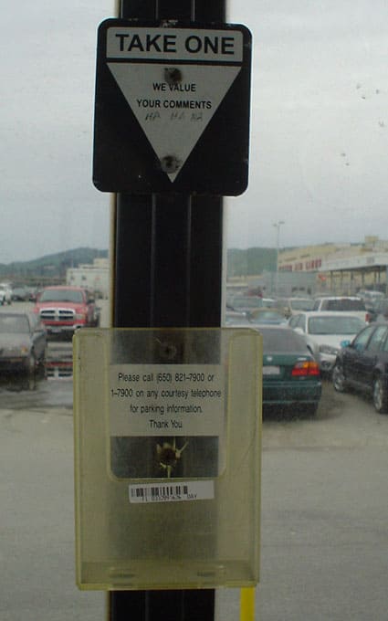
Take One We Value Your Comments

dsc02922-copy.jpg
These feedback forms in the SFO Long Term Parking bus shelter are always empty. Someone has written Ha Ha Ha as a sarcastic bit of feedback, presumably about the implied hypocrisy of an unmaintained feedback mechanism.

There’s a phone number (that would ideally be covered by feedback forms) that you can call from a telephone (if you’re carrying one) or a courtesy phone (once you get into the airport itself, a 10 minute drive away), for parking information. Parking information? You’ve already parked, if you’re seeing this. The sticker is out of sync with the feedback form holding function.

Series

About Steve