Posts tagged “street-art”

Out and About: Steve in Melbourne

Here is the last post with highlights of my trip to Australia (see parts 1, 2 and 3, previously). Meanwhile, all my pictures are making their way to Flickr.


At the tram stop for the Children’s Hospital, the platform is filled with various cute “Dr. Jake” signs. I especially like transforming the transformer box into a height chart. Someone is thinking broadly about reframing the hospital from scary into welcoming and using the first point of entry – the tram stop – as the place to begin doing that.


Patience is a virtue. A post-design attempt to mollify confused users.


I could not figure out what the heck “Teady” referred to on this first truck. It wouldn’t be my first time encountering a word I didn’t understand (see “showbag” in an earlier post, say). But no, the adjacent truck says “Steady.” I went back and checked – did the initial S wear off? No, it was never there to begin with. The design – sans S – fits perfectly in the designated area on the first truck.


Bold language boldly presented.


Once again, weird people sculptures.


Free WiFi at the train station. Nice visual reference to many memes (e.g., Star Wars kid, the dancing baby, keyboard cat) as well as Facebook and Twitter.


ACDC lane. Yes, the official City of Melbourne lane commemorating ACDC.


Reminded me of a similar sign in San Francisco.


The menu at this restaurant offered beer in a pot or a beaker. I was further charmed by the use of familiar words with shifted meanings, as part of my foreigner’s journey. But no, the beaker is exactly what you’d think: a beaker.


More 8-bit-videogame streetart, although Mario instead of Space Invaders; stickers instead of tiles.


Many many flavors of hot chocolate at Chokolait. I must go back!


Indoor nighttime climbing wall.

Out and About: Steve in Barcelona (2 of 2)

More observations from the trip to Barcelona. See part 1 here (and the complete set on Flickr).


Graffiti scarification. At Park Guell, people mark the cactus so future tourists can see that they were there and they were douchebags.


I’m sure I’ve never seen a sign for a detective agency before. But within days of seeing this, I come across a New Yorker article excerpting Mavis Gallant’s diary from Spain, in 1952. She mentions the ubiquity of signs for detective agencies in Barcelona! Who knew?


Gaudi’s Casa Batll??.


Delicious pinxtos.


Recycling depot with a book-exchange rack and a used-clothing-for-charity collection box.


The presentation and form factor of the Jam??n ibérico is sufficiently iconic that you can buy an inflatable non-meat version.


Gestural guidance.

Out and About: Steve in Lisbon (2 of 2)

More observations from last week’s trip to Lisbon. See part 1 here


Street art.


Body-enhancing undergarments.


Clooney.


Eat box? Yum!


Y’arr! Pirate Bar! That’s some great neon. Perfect place for Drink Like A Pirate Day.


Scented dolls? They look pretty intense. Perhaps they inch forward menacingly as you pass by their window.


The design museum was redoing its facade with sticky notes. We watched their progress over several days.


This is the take-a-number device for a retail queue. Far more advanced than the familiar North American paper ticket dispenser. And also unrecognizable if you don’t read Portuguese and don’t know to look for this.


Detail of a building exterior. Tiled buildings are ubiquitous, with many different beautiful tile designs of various vintages.

Curating Consumption now playing at Johnny Holland

We are delighted to announce the debut last week of our new series, Curating Consumption on Johnny Holland. The idea was born right here on All This ChittahChattah as an occasional curated collection of musings, seen through the bifocal lens of consumer/researcher. Not to worry if you missed it, we have it right here!

When is a door not a door? When the sign on it clearly states “Do not Touch, Pull, or Use This Door. Thank You!” I came across this (not a) door during a recent fieldwork trip to New York City, where I found myself invariably studying every door I walked by because they all seemed to have great stories to tell. Sadly, this story is one of inability to fulfill one’s useful purpose. What is a door if it is not a portal to some other place; a threshold to cross? Now it is a wall, and a window. I wonder if it will be repaired or replaced or reframed as an aesthetic relic that will remain in its present location and state of dysfunction. /TC

This television was hanging out on the sidewalk in the Mission, right here in San Francisco. I am curious who labeled this anthropomorphized electronic with feelings of inadequacy. It could have been added by a passerby; a reflective commentary on the choice by the TV’s previous owner to upgrade and abandon. In fact, a man passing me as I shot this picture told me “I love rich people, man! They throw away the greatest stuff. I got a vacuum cleaner last week that works perfect.” Or maybe the words were put there by the person who left that unsatisfying TV on the street. A “Dear John” letter from consumer to consumed: It’s not me, it’s you. /TC

When visiting Dublin, I was prepared for (and delighted to experience) all Guinness, all the time. What I didn’t realize was the supporting infrastructure required to make that happen. They’ve got tanker trucks of the stuff rolling down the street to meet the demand. /SP

Just days after the Kony 2012 video went viral, hitting the national media, images of the dictator appeared as stencil art on the streets of Austin. From Facebook and YouTube, the story touched the activism (or some say slacktivism) nerve. But what meaning is implied or inferred when the medium changes? Stencil art is hip, ironic, anti-mainstream. The street art form has none of the outrage of the previous forms. Is the previously unknown Kony now accorded folk hero status? /SP

Observing Dublin (part 2 of 2)

More pictures from my trip to Dublin for tbe IxDA Student Design Challenge. Also see Part 1.


There is a chain called TJ Hughes in parts of Europe, so they swapped out the J for a K in order to prevent confusion.


KitKat deathmatch?


Most charming packaging, ever!


Dublin doors.


The classic, interpreted two ways.


Viking marketing.


Differentiation?


Damn right it hurts.


Local retail aesthetics.


Treasures in the trash.

Out and About: Julie in LA

Despite my relative proximity to it, LA is not a city I’ve had much occasion to visit. But I was there last week, with Tamara! Here are a few snaps I took in-between fieldwork interviews and client pow-wows. Most of these are from Venice Beach, with the exception of the last shot, which was taken in Burbank.

Napping Aliens
Clad in familiar brands (LA Lakers, Spongebob Squarepants, USA), this pile of patriotic aliens comes across as just another family of worn-out tourists.

Faces
The face, three ways.

Stickers in your face
Upper left is a riff on Shepard Fairey’s original Andre The Giant Has A Posse sticker. This one reads “Chopstick Charlie has one crazy posse,” then lists Chopstick Charlie’s dimensions at 5′ 11″ 150 lbs. (Note: If you are easily offended definitely do not look too closely at the nose and lips stickers).

Shapes and figures
I discovered a moment of serenity and geometry in the midst of the madness.

Something surreal
Magritte and the Surrealists are clear influences here.

Retail guillotine
It’s all about the body.

Environmentally friendly
The neon juxtaposed with this message of environmental consciousness comes off as deliberate irony! See Tamara’s Out and About: LA for her shot of this unique dry-cleaning establishment.

ChittahChattah Quickies

Who Arted? Framing a Curatorial Intervention [Core77] – Steve and I talked about how great it is when street artists build on each others’ work in our Interactions article, Kilroy was Here. The “Who Arted” group has really formalized this idea in parts of Brooklyn, serially framing, thereby curating street art.

But what are we to take away? Is this some counter-establishment commentary? Some kind Dadaism reincarnated or an art project born of a lazy Saturday evening “potluck” that comes in little plastic baggies? Ha! Is it some conservative attempt to contain and sterilize an otherwise loose and “free” art form? Are these frames meant to control and connote a more sanctioned museum-like quality? -OR- More intriguingly, is this a fun, yet purposeful recommendation towards a comfortable middle ground; a less combustible space between tension and expression?

ComScore Study Confirms What We Already Knew: You’re Wasting Money on Ads No One Sees [AdAge Digital] – Many, many apps and web-based services (and concepts we encounter on projects regularly!) are predicated on an advertising-based revenue model, but (as we all know from our own behavior – this study is in the category of things-we-really-didn’t-need-a-study-to-know) these ads are very rarely even glimpsed. If a banner ad falls in a forest, etc…what are the implications to our virtual-economy?

ComScore announced it has developed measurement software it’s calling Validated Campaign Essentials, which includes at its core an analysis of which ads in an online campaign were in-view (50% of the ad must be viewable for at least one second.) The company said at an event this morning that it tested out the software over the last two months on campaigns for 12 big brands, including Kraft Foods, Ford, and Sprint. One of the key findings: 31% of the 1.7 billion ad impressions were never in view.

Buying the Body of Christ [Killing the Buddha] – This is a pretty thorough history of the Cavanagh Company, a 69-year old business that provides a product believed by many to transmogrify into the body of Christ: altar bread. A wide variety of influences cultural, logistical, ritualistic, theological and economic have driven innovation over the years. The company is now faced with bitter bested competitors (nuns!), niche-products (gluten-free wafers) and Polish knock-offs, all of which threaten their 80% market share.

Had production remained the exclusive bailiwick of monastic communities, it is likely that the findings of Vatican II would have prompted some minor changes in Communion-wafer production. Among the guidelines issued by the Church was a directive to “make the bread look more breadlike,” head of production Dan Cavanagh told me. It is a change whose significance may yet be lost on the millions of churchgoers who continue to think of hosts as a form of Styrofoam. Nevertheless, Cavanagh’s more “breadlike” whole-wheat wafer caught on. It became the industry standard, and forced the Poor Clare nuns to follow suit. In fact, the doctrinal changes of Vatican II were only a starting point for innovation. The Cavanagh Co. soon led the way to wholly aesthetic alterations in the host, to marketing campaigns and 1-800 numbers. The ethos of the altar bread industry changed profoundly, which is precisely what the Sisters of St. Clare found so unjust: ‘And they had the audacity to send samples and a price list to every parish in the United States! We were doomed. Priests started calling to say they preferred the “other” breads. Orders dropped. Our spirits drooped.’

Out and About: Julie in Portland

I visited the great city of Portland, Oregon over Thanksgiving week, and noticed some of the ways its denizens use surfaces to communicate and express. Like Steve did earlier in his recent post, Out and About: Steve in Boston, given our recent interactions article about noticing and documenting street art, Kilroy Was Here, I too wanted to share some snaps!


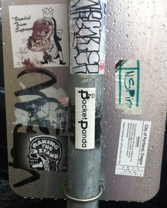
As elsewhere, the backs of city signage serve as canvas for quick-stick expression. The tiki-figure here is one I commonly see in the Mission neighborhood of San Francisco, where I live, which surprised me and gave me a little charge, a feeling of connection to home.


A City of Portland sanctioned sticker, which includes a number to call to report damage to this sign, sits alongside its renegade brethren.


Great juxtaposition of two messages about the dangers of inhaling alongside a DANGER sticker.


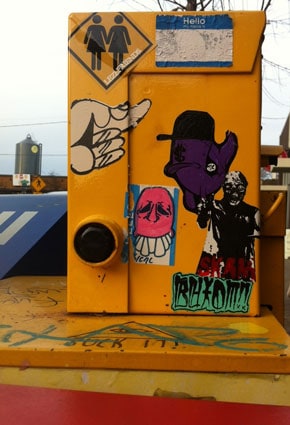
I appreciated the friendly, bubbly, colorful style against the rainy, grey backdrop of Portland. Contributors to the collective urban collage here seem respectful of each others boundaries – not much overlapping of images.


And, finally, bunnies!

Street Art Quickies

Kilroy Was Here, our column about street art, was recently published in interactions. In the time between finishing the article and its publication we’ve found a range of articles and links that go with it.

‘Gold Mountain’ history mural marred by graffiti [SFGate] – Murals, a legitimized and desirable form of street art are still vulnerable to others with spray paint. We call one “street art” and the other “graffiti” or worse, “tagging.”

Someone has written “easy girls” next to the group of 1940s Forbidden City cabaret dancers. The Chinese Telephone Exchange pagoda is obscured by spray-painted green scrawls. The likeness of 9/11 flight attendant Betty Ann Ong that was added to the mural in 2004 is almost covered by a bright orange tag. In 2004, it cost $25,000 to restore the mural. Even as the artist repainted the mural, taggers continued to mar her work. Security cameras were installed in 2008, but new graffiti appears nearly every week. Now, officials at Chinatown Community Development Center, which owns the apartment building on which the mural is painted, say they’re considering re-creating the mural somewhere else. So far the nonprofit has been cited for the graffiti, but has not paid any fines. “It’s impossible to keep up with taggers, and we don’t have the manpower or the funding,” said Cathie Lam, the center’s senior community organizer. It was “determined not worthwhile and too labor-intensive” to restore it a second time, she said.

Vigilante Vigilante: The Battle for Expression – We attended the first screening of this film. The movie, despite its extraordinary bias towards street art, was extremely thought-provoking. The screening itself was dramatic and intense, with the post-film discussion devolving into shouting, name-calling, and some gang-related threats.

A new breed of crime-fighter now stalks the urban landscape: the anti-graffiti vigilante. These dedicated blight-warriors stop at nothing to rid their neighborhoods and cities of street art, stickers, tags, and posters. Yet several of these vigilantes have become the very menace they set out to eliminate. In their relentless attempt to stamp out graffiti, they have turned to illegally and destructively painting other people’s property. VIGILANTE VIGILANTE is the story of two filmmakers who set out to expose these mysterious characters and discover a battle of expression that stretches from the streets to academia.

Graffiti Taggers Turn to Trees, With Some Possibly Harmful Effects [NYT.com] – Another disturbing example; where self-expression triumphs all other considerations.

Outside Elixir bar in the Mission district of San Francisco, graffiti taggers have left their mark – not on the wall, but on the living. Every tree on that 16th Street block has been spray-painted in shades of purple, red, white and black. “I can’t imagine why anyone would think that’s O.K.,” said Shea Shawnson, the bar manager. “What do you do to clean up a tree without messing it up?” In a city where graffiti abatement is swift – property owners are fined if graffiti is not immediately removed, and the city spends $20 million on the problem – taggers have discovered a way to ensure that their mark has staying power. Graffiti, taggers believe, is not easily covered or removed from trees without harming them. The vandalism has angered residents, and possibly threatened the health of some trees, which are remarkably rare in San Francisco because very few tree species are indigenous. The tagging also appears to violate one of the tenets of the graffiti subculture: it is supposed to be a reaction to urban life, not an attack on nature.

Street Art As Provocations To Change The World [design mind] – frogdesign documents a couple of powerful street art examples driving towards awareness, and ideally social change.

JR is a photographer and artist that describes himself as a “photograffeur.” He flyposts large black and white photographic images in public locations-in a manner that is similar to the appropriation of the built environment by graffiti artists. The idea is to show the world its true face by pasting photos of human faces across massive canvases. One of his most famous projects is called “face2face.” For this, he worked with Palestinian and Israeli citizens to explore the similarities of their daily lives, rather than focusing on the divisions; he highlighted fundamental human emotions. Israelis and Palestinians doing the same job-such as taxi drivers and teachers-agreed to be photographed crying, laughing, and making faces. Their portraits were then pasted without authorization from the local authorities in eight Israeli and Palestinian cities as well as on two sides of the wall that separate the two countries, demonstrating that art and laughter can challenge stereotypes. He explained his concept, by showing two portraits (one Israeli, one Palestinian) and asked them: who is the Israeli and who is the Palestinian. Most people couldn’t answer him. That’s when they understood that behind their cultural differences, they are very similar, and remain human first and foremost, and human with similar values!

Brian Barneclo painting “Systems Mural Project” [SFGate] – Yet another example of street art crossing over; here with an official authorized sponsored ‘landmark.’

“It will be a new landmark,” Barneclo said, pointing out that the painting near Seventh and Townsend streets will be the first thing commuter train passengers see entering San Francisco and the last thing cars zoom by as they take the Interstate 280 on-ramp from Sixth Street. “There’s nothing else like it.” Using large-scale icons, the piece aims to illustrate the many relationships between man and nature – from the nervous system to the solar system, computer operating systems to the ecosystem. “I’m just intrigued by how the world works,” Barneclo said. “It’s complicated, but I’m trying to boil it down and make a groovy mural.”

Out and About: Steve in Boston

I was in Boston earlier this week to speak at UI16. During a bit of downtime, I went for a walk and of course, started taking pictures. Given our recent interactions article about noticing and document street art, I wanted to share some of what I saw.

One tag (bundtcake? budcloth? badclam?) and stickers for a cutesy-brand pet waste removal service, a skater magazine, a web/movement/thingy, and a beer label that seems to be fake and actually points to a local art collective.


There’s that tag again, the Eye of Providence (a local reference?), and a DJ promoting himself with an homage to the locally dominant Dunkin’ Donuts branding.


Some buffing of previous stickers, that same beer cum art sticker, and the random and hilarious Vonnegut and crossbones (I found a better one here).


Much larger pieces, including Andre. I like how you can see a little bit about how these were done, as they emanate from the fire escape.


A number of streetlights near here had these colored plastic blocks in letter-like forms. I felt like it was probably “official” since it was in a vaguely design-y district and consistently placed on city infrastructure, but there was no information about it and so it was hard to be sure. And that moment – trying to determine if this is “legit art” or “street art” or one masquerading as the other – was delicious. I passed by here with my local friend Joe and asked him about this. While he didn’t know, for him it evoked the 2007 incident when 8-bit-graphics promoting Aqua Teen Hunger Force caused a bomb scare in Boston.


Under the bridge. Just a more familiar graffiti scene, one that seemed to typical, unremarkable, and even slightly comforting (despite the broken glass I had to step around to take this picture).

Our latest article: Kilroy Was Here


Our latest interactions column (written by Steve Portigal and Julie Norvaisas) Kilroy Was Here has just been published.

Reviled or celebrated, graffiti is ubiquitous in even the least-urban environments. With roots in the wall-scrawled slogans of ancient Greece, it is a physical yet ephemeral expression of the personality of a neighborhood. It allows us to see a colorful trail of inhabitants’ interactions with public spaces. Graffiti (or street art, or urban art) has been displayed in (and arguably corrupted by) art exhibitions, influenced fashion and pop culture, and generated revenue for municipalities and the paint-removal industry alike. Of course, it’s largely illegal. It’s everywhere, and we are grateful. Perhaps we are drawn to the element of danger that feeds street art, and the rebellion implicit in its enjoyment (probably the same reasons we loved the Fonz!)…We find ourselves considering the street art of one city, or neighborhood, or corner, as a whole, compared to what we know from other cities, neighborhoods, and corners. What elements make them visually distinct? What might these observations say about the culture or history of the location? How does one graffito fit into the larger context of surrounding graffiti? We can channel our inner visual anthropologist, uncovering signs not only of the times but also of the place.

Get the PDF here and let us know what you think. Do you follow street art? What do you like about it? Share your pictures with us!

And, here are some photos to supplement the article

Previous articles also available:

The Dolores Park graffiti artist story

Here’s a photo I took in San Francisco during the Summer of 2010, my first summer living here. The image now appears on my business cards in our “What’s Your Story?” series.

I don’t know who this man is. Where he is, that’s easier: Dolores Park is a small park, two blocks by one block, in the middle of the city. It serves as a gathering place for a variety of inhabitants hailing from the colorful neighborhoods the park borders and defines: the always festive LGBTIQQ contingent from the Castro, picnicking families from Noe Valley, Old Style-sipping hipsters and slouching Hispanic teens from the Mission, and drumming hippies from the nearby Haight…and various intersections of the aforementioned. On this day, a festival sprung up on the hill involving DJs and street artists.

The angle of the sun was just right to catch this artist in a reflection of his own process.

Here’s a broader shot of the scene.

Street art, which usually happens under cloak of darkness, had a light shining on it that day.

Out and About: Julie in New York

My aimless wanderings between meetings and meals in Manhattan last week led to observing these collisions of order and chaos.

Cupcakes at Dean and Deluca (Greenwich Village) bear a resemblance to the tiered visuals and colors of the crowd (Times Square).

Impact emerges from the pattern of repetitive elements in street/sidewalk art (SoHo) and tagged signage (Chinatown).

ChittahChattah Quickies

  • [from julienorvaisas] Posters Promoting Non-Events, Everyday Life [DesignTAXI.com] – [Delightful celebrations of the stuff of everyday life!] These posters don’t advertise a gig, a club night or any worthwhile event. They’re for the mundane things: enjoying a sunny day, singing in the shower, or anything that we do everyday but don’t realize. Created as part of the EDPED (Each Day Posters Every Day) project, the posters are designed to highlight how 'no activity in your life is too boring or mundane.The idea is to take trivial activities and promote them with posters to give them a sense of importance they ordinarily would not have.'
  • [from julienorvaisas] Customizable Stencil Lets Anyone Make Street Art Infographics [GOOD] – [Pretty cool idea, but we all know that the power of statistics in the wrong hands can be dangerous. I can't help but notice that the kit doesn't include a spot for a citation of source! I imagine this kit being mostly used for humorous imaginary statistics ala thisisindexed.com rather than political commentary.] With the help of a new pie chart stencil by interactive media artist Golan Levin, creating politically charged graffiti just got a bit easier. The fully customizable "Infoviz Graffiti" toolkit allows users to quickly swap out the numbers and letters and adjust the slice of the pie. 

Series

About Steve