Posts tagged “icon”

ChittahChattah Quickies

I gave a talk recently where I advocated for the importance of being aware of pop culture; this led to an interesting conversation (where not all parties agreed with my proposal). This set of quickies is dedicated to pop-culture-specific examples of note.

‘Les Misérables’ and Irony [NYT] – While I haven’t seen (and don’t plan to see) this movie (the stage show was enough for a lifetime), this analysis of the film’s cultural performance (and why that may explain it’s appeal to some) is pretty wonderful.

The key to what is intended by these technical choices was provided for me by Hooper himself when he remarked in an interview (also printed in USA Today) that while “we live in a postmodern age where a certain amount of irony is expected, [t]his film is made without irony.” Irony is a stance of distance that pays a compliment to both its producer and consumer. The ironist knows what other, more na?Øve, observers do not: that surfaces are deceptive, that the real story is not what presents itself, that conventional pieties are sentimental fictions.

The artist who deploys irony tests the sophistication of his audience and divides it into two parts, those in the know and those who live in a fool’s paradise. Irony creates a privileged vantage point from which you can frame and stand aloof from a world you are too savvy to take at face value. Irony is the essence of the critical attitude, of the observer’s cool gaze; every reviewer who is not just a bourgeois cheerleader (and no reviewer will admit to being that) is an ironist.

“Les Misérables” defeats irony by not allowing the distance it requires. If you’re looking right down the throats of the characters, there is no space between them and you; their perspective is your perspective; their emotions are your emotions; you can’t frame what you are literally inside of. Moreover, the effect – and it is an effect even if its intention is to trade effect for immediacy – is enhanced by the fact that the faces you are pushed up against fill the screen; there is no dimension to the side of them or behind them; it is all very big and very flat, without depth. The camera almost never pulls back, and when it does so, it is only for an instant.

Netflix to Deliver All 13 Episodes of ‘House of Cards’ on One Day [NYT] – I’m intrigued by how technology affords shifts in media consumption and then how those shifts inform the content of the media itself.

Netflix will release a drama expressly designed to be consumed in one sitting: “House of Cards,” a political thriller starring Kevin Spacey and Robin Wright. Rather than introducing one episode a week, as distributors have done since the days of black-and-white TVs, all 13 episodes will be streamed at the same time. “Our goal is to shut down a portion of America for a whole day,” the producer Beau Willimon said with a laugh. “House of Cards,” which is the first show made specifically for Netflix, dispenses with some of the traditions that are so common on network TV, like flashbacks. There is less reason to remind viewers what happened in previous episodes, the producers say, because so many viewers will have just seen it. And if they don’t remember, Google is just a click away. The show “assumes you know what’s happening all the time, whereas television has to assume that a big chunk of the audience is always just tuning in,” said Ted Sarandos, Netflix’s chief content officer.

Muzak, Background Music to Life, to Lose Its Name [NYT] – Do we mourn when a derided brand goes away? The awful experiences that brand promised us – and perhaps much much worse – still seem to be on offer. I will shed no tear.

The Muzak name – long part of the American vernacular, if sometimes as the butt of jokes – will be retired this week as part of a reorganization by its owner, Mood Media. The company is consolidating its services under a single brand, Mood, thus eliminating the Muzak name…”We have a team of music gurus, visual specialists, sound and scent-tech experts,” Mr. Abony said. “We develop compelling, consistent experiences that connect our clients with their customers. The new brand signifies the integration of the company.”

New symbols for new times


Medical marijuana dispensary, Sausalito, CA, November 2010

I was unable to find out about this symbol’s history or affiliation. Green Cross is a common term/symbol for medical pot, but seems tied to various local organizations (including a delivery service in San Francisco), while this specific graphic didn’t show up anywhere in my searches. Meanwhile, as new symbols and meanings emerge they can sometimes conflict: Green Cross is also an international organization, based in Switzerland whose mission “is to respond to the combined challenges of security, poverty and environmental degradation to ensure a sustainable and secure future.” When multiple groups appropriate and recontextualize an existing symbol (in this case the Red Cross) that collision is ever more likely.


Unisex bathroom sign, San Francisco, CA, August 2010

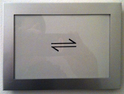
While this sign, seen in the Commonwealth restaurant, may actually be a branding icon for the restaurant (since it appears on their menu) and not a new symbol for men-plus-women, given its visual insinuation, and application (appearing on two adjacent doors, just where you’d expect to find the bathrooms), it begins to suggest a broader meaning. Unisex bathroom signs are typically denoted by the icons for men and women, together but the idea (intentional or not) that this usage has a gestalt not fully addressed by combining existing symbols is a powerful one.

What new symbols and new meanings are you seeing?

The package is the brand. Now what?


Method soap in here, Virgin America, June, 2010

On a recent Virgin America flight, I saw they were featuring Method hand soap in the bathroom. But (as they have obviously realized) Method’s brand is more recognizable via the uniquely designed dispenser than the name, so the identifying sticker shows a picture of that shape. You don’t have the opportunity to use that container, but by interacting with the generic goo dispenser in the bathroom, perhaps you are supposed to associate somehow with the visual and tactile interaction with the iconic dispenser.

The Virgin America experience seems to be partly about aggregating a hip, design-y, youthful set of other brands for travelers to experience (e.g. BoingBoingTV), but I’m not sure this is a win for Method, or Virgin America. VA seems to have rethought so many traditional aspects of air travel (such as their fantastic safety video) but this compromise evokes the overcompensating-unhelpful-infographic-signage common in commercial aircraft interiors, where you can’t help but feel trapped in a world of call-outs (like the Ikea Catalog scene in Fight Club). And Method takes a straddle position, suggesting that their goo is just goo, if they are forced to offer a visual reminder of the container to help us connect with what is different – and better – about their product.

Localized Wayfinding

parking
drawbridge
Airport Wayfinding, Schiphol Airport, Amsterdam, May 2009

The first time I ever encountered localized parking designation was my childhood visit to Disney World; the tram drivers reminded us we were parked in Goofy 7 or Mickey 7 or something. Of course, I still enjoy taking note of it (see a recent post here). The highly-localized version above was entertaining and both confusing and educational (the herring icon makes no sense until one discovers that the Dutch really love their herring). Now, this confusion is inevitable when traveling and (as I’ve written about before) can be a great opportunity for learning. And practically, most people that park at the airport are locals, not incoming tourists, so there is little impact on the experience from not understanding the reference. Indeed, since nothing about the icon is meant to convey its function, serving only to label a particular region, visitors can still make use of the bird-on-a-post (?) icon perfectly well, without any understanding of its meaning.

Son of Survey Madness

We’ve posted any number of survey design critiques over the years, and here’s the latest, a close read of a question and the cues associated with different responses.

In response to the prompt How closely do you agree or disagree with this statement: “We saw business strengthening in the Spring, but it seems to be stagnant or falling off again. We thought we had seen the bottom, but now we are not sure.” we’re asked to move a slider between Agree Completely and Disagree Completely.
smiley
frowny

As we move the slider, the expression on the little green character changes, supposedly to provide an additional cue to ensure that our response is accurate.

But when we agree (a positive emotion), the guy is frowning. Because we are agreeing with a negative in which case we making a negative observation? So we feel negative? But the green dude isn’t mapping our feeling about the situation, he’s mapped to our response – our degree of agreement. We can feel positive about agreeing, even if the thing we agreeing about is negative (haven’t you ever exclaimed enthusiastically at someone that expresses a similar frustration to you? That’s being positive about a negative). The mapping here is wrong.

It’s further complicated by the indirectness of the prompt – that situation you are agreeing or disagreeing with – describing a situation going from positive to uncertain. How much do you agree or disagree with: something was positive but now it’s negative? In fact, besides being indirect and somewhat abstract, it’s also a compound question. You might agree that things were positive, or you might now. You might agree that things have gone downhill, or you might not. The question is asking you to agree ONLY to the cause where i) things were positive and ii) things have gone downhill. If you don’t agree with both of those, then what do you do? And since you can indicate the strength of agreement/disagreement, how will people interpret the question? I would suggest not very reliably!

Ironically, this is a survey aimed at providers of market research services, who should absolutely know better.

New Coke

Hot, Flat and Crowded

flat-coke


The Real Thing?

new-coke-in-action


I started seeing and photographing these coke bottle simulacra last summer. I wonder: will the Coke bottle be as evocative an icon for future generations if they come to know it primarily as a flat form?


coke-collage
Zippo Lighter; Gene Simmons Coke bottle from France; Classic soda fountain sign

Related posts:
Swallowing innovation
Candy-coated history
Putting research results back on the shelf

ChittahChattah Quickies

  • Large collection of (actual?) screenplay pitches (technically query letters). – Just one:
    Title: Remnants of Hammers
    Logline: Constant bickering drives this comedy-drama as the plots of immature Bill, rabble-rousing Eldon, and ex-Marine George converge upon poor Dr. FitzUrse.
  • The Che brand – In "Che’s Afterlife.” Casey has written a book that is not only a cultural history of an image, but a sociopolitical study of the mechanisms of fame. It is about how ideas travel and mutate in this age of globalization, how concepts of political ideology have increasingly come to be trumped by notions of commerce and cool and chic, and how the historical Che gave way to other Ches: St. Che, said to possess the ability to perform miracles; Chesucristo, a Christ-like figure revered for his ideals, not his advocacy of violence; an entrepreneurial Che, promoting the lesson “that individuals should honestly strive to produce their utmost for the good of all”; and the Rock ’n’ Roll Che, more representative of youthful anti-authoritarianism than of any political dogma. Che has become a generic symbol of the underdog, the idealist, the iconoclast, the man willing to die for a cause. He has become “the quintessential postmodern icon” signifying “anything to anyone and everything to everyone.”

Mixed Signals

cool
From a recent rental, here’s a dashboard indicator I’d never seen before. As far as I could figure out, while the car is warming up, the engine temperature light shows a green “cool” indicator. At least, it disappeared after a few minutes, so I concluded that was associated with the car warming up. We don’t want the engine to be too cold, and any indicator at all is perhaps a bad (or less good) thing, so it seemed to be a warning. But green is good, so is it good that it’s lit up? Is it good that the engine is cool? Is it bad when it goes out?

See more of my Vancouver pictures here.

Automobile Avatars

familyaboard.jpg

I’m seeing a lot of these lately on rear windows of minivans and similar larger family-sized vehicles: icons that represent every member of the household (including pets).

Seems like a new example of personalization; an untapped bit of car real estate, and a new message to publish (who are the – writ rough – people in our household).

I wonder if this is more common among Hispanics and/or the churchgoing. Any ideas? Do you have one of these? Where did you hear about it? Where did you get it?

Body Self-Image

Photos from my various travels depicting global cultural variations of the fundamental person icon.

bali.jpg
bali2.jpg
Bali, Indonesia. They’re some pretty small people, so why does that first person seem so hulking and Cro-Magnon-y?

taipei2.jpg
taipei1.jpg
Taipei, Taiwan. Note the hip chapeau the stroller is sporting, and the protective headgear (?) worn by the worker.

london.jpg
London, UK. This fellow toils as above, but without the benefit of a helmet. Less chance of sunburn, maybe?

tokyo.jpg
Tokyo, Japan. The Japanese cute aesthetic shows up in the large head and even larger cigarette.

bangkok.jpg
Bangkok, Thailand. Who takes care of children?

providence.jpg
Providence, RI, USA. Not just walking, but actively moving forward, dancing, and exuding joie de vivre.

And Karrie Jacobs has a nice example here.

The toilet flusher that comes with an explanatory memo

A few years ago I blogged about my first encounter with a dual-flush toilet.

They are becoming more common, now.
flush.jpg
Uppercut, by Sloan, is an interesting, if incomplete design solution. It retrofits into existing toilets. The green handle suggests to the flusher that something is different here. The iconics on the barrel indicate, somewhat, what will happen in different flushing directions. But they’ve also seen fit to provide “attractive instructional placards to educate the user [there’s that phrase again] on proper operation” – UPfor #1 (Liquid Waste), DOWN for #2 (Solid Waste). The Sloan website also provides a customizable memo (.DOC) to help get the word out.

Any change of behavior, especially in such a habitual task, is going to be a challenge. Yet office memos about flushing the toilets belong with training meetings on using the new photocopier in the thundering hell of office life. It’d be interesting to investigate how all these cues (the memo, the green handle, the icon, the placard, the memo) work together (or not) to help people shift behavior (or not).

Any anecdotes to share about new office equipment, toilet memos, or so on? Leave a comment!

Series

About Steve